Poetry review – A POST CARD TO: Alwyn Marriage considers an unusual book by John Greening and Stuart Henson – and advises us not to judge it by its cover!
 a Post Card to
John Greening & Stuart Henson
Red Squirrel Press, 2021
ISBN 978-1-913632-02-1
59 pp £10.00
a Post Card to
John Greening & Stuart Henson
Red Squirrel Press, 2021
ISBN 978-1-913632-02-1
59 pp     £10.00
What a great idea! These two poets have, sporadically over the years, written sonnets while travelling and sent them to each other on postcards from places they have visited. They have now, perhaps taking advantage of this strange lockdown year, gathered these poems into a booklet. To read through the poems is to be taken on a whistle-stop tour of holiday destinations in Britain and Ireland, Germany, France and Italy, the United States, Iceland and Greenland. I found it a delight to sit in the comfort of my home, when travel is impossible, and be taken to such an interesting range of exciting venues.
Some of the poems are highly evocative:
	Landscape of mists, of fortresses and falls
	where Edward's thirteenth-century castles rise
	out of native rock, and Turner skies
	wash in like tides against their crumbling walls.
                                                             (SH to JG from North Wales, 1994)
Not surprisingly, with a project undertaken over so many years, not all the sonnets are equally successful; and I would have liked to have seen a little more variety in terms of the sonnet form. I am sure that did not matter when the postcards were spaced widely over time, but when brought together into a booklet, there is a need for at least a little variety of style. Personally, I love sonnets, but if unrelieved by other forms they need to be carefully controlled, using such potential variety that there is within the sonnet form itself. Certainly, after pages of mainly Petrarchan sonnets, the Shakespearean ‘Postcard from Verona’ came as a welcome diversion – and one that worked particularly well (page 53, SH to JG, 2019). And there are, of course, I’m glad to say, a few other examples of different sonnet forms.
Another (welcome) change of style comes in the series of four rhymed 8-liners, “Deaths in Venice” (pages 27-30), of which iv is especially successful, and worth quoting in full:
	No sound when they lay down Diaghilev
	or when Stravinsky joined him for that one
	last dance through time, beyond belief
	and into myth. Watched by the evening sun
	behind the city, from their spotlit grave
	they count the dreadful complex beats that soon
	will tell them: your scene's over. But the rite
	they share this time is one long opening night.
                                                               (JG to SH from Venice, 2007).
It is interesting, and perhaps not too surprising, that in general the later poems are among the best. I am sure that is encouraging for the poets, for it provides evidence, if it were needed, that they are still developing as writers. In particular, I enjoyed “Giovanni di Paolo’s Flight into Egypt“, (SH to JG from Sienna, 2018) and “In Conwy Churchyard” (SH to JG from St Mary’s & All Saints Church, Conwy, 2019). This latter begins with the lines:
	Slow ivies grope across the tombs and twine
	about the names of draper, shipwright, curate...
	Their genealogies, set down in slate,
	are safe now from the ravages of time.
Bringing the collection of missives bang up to date, two of the final poems reflect on covid lockdown, which has brought the poets’ normal travels to a standstill.
	That time of year when I'd expect a card –
	a poet's face, a castle, boats, hills, frescoes –
	and you would too. Here in this yellowing yard
	there is no visiting, unless it's Tesco's.
	A virtual greeting then.
                                (Washing the Shopping. JG to SH, Stonely Cambridgeshire, 2020)
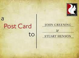
Having enjoyed the vicarious travels and admired some of the sonnets, I must, I’m afraid, comment rather less than enthusiastically on the cover. Again, full marks for a really great idea: the booklet cover is presented as an old postcard, with the title on the left hand side, the poets’ names on the address side, and the logo of the publisher where the stamp would be. Even the background colour faithfully recalls a slightly stained old-fashioned postcard.
But, clever as this device is, the result is, unfortunately, so dull that it is highly unlikely to tempt a potential reader to pick the booklet up in a bookshop. This is a pity, when there are treasures within. It feels rather churlish to criticise the cover, because creating it thus was a pleasing and imaginative idea, and I don’t know what could have achieved the result in a more interesting fashion. But it would be a real pity if the design of the cover were to detract from the book.
Feb 12 2021
a Post Card to
Poetry review – A POST CARD TO: Alwyn Marriage considers an unusual book by John Greening and Stuart Henson – and advises us not to judge it by its cover!
What a great idea! These two poets have, sporadically over the years, written sonnets while travelling and sent them to each other on postcards from places they have visited. They have now, perhaps taking advantage of this strange lockdown year, gathered these poems into a booklet. To read through the poems is to be taken on a whistle-stop tour of holiday destinations in Britain and Ireland, Germany, France and Italy, the United States, Iceland and Greenland. I found it a delight to sit in the comfort of my home, when travel is impossible, and be taken to such an interesting range of exciting venues.
Some of the poems are highly evocative:
Landscape of mists, of fortresses and falls where Edward's thirteenth-century castles rise out of native rock, and Turner skies wash in like tides against their crumbling walls. (SH to JG from North Wales, 1994)Not surprisingly, with a project undertaken over so many years, not all the sonnets are equally successful; and I would have liked to have seen a little more variety in terms of the sonnet form. I am sure that did not matter when the postcards were spaced widely over time, but when brought together into a booklet, there is a need for at least a little variety of style. Personally, I love sonnets, but if unrelieved by other forms they need to be carefully controlled, using such potential variety that there is within the sonnet form itself. Certainly, after pages of mainly Petrarchan sonnets, the Shakespearean ‘Postcard from Verona’ came as a welcome diversion – and one that worked particularly well (page 53, SH to JG, 2019). And there are, of course, I’m glad to say, a few other examples of different sonnet forms.
Another (welcome) change of style comes in the series of four rhymed 8-liners, “Deaths in Venice” (pages 27-30), of which iv is especially successful, and worth quoting in full:
No sound when they lay down Diaghilev or when Stravinsky joined him for that one last dance through time, beyond belief and into myth. Watched by the evening sun behind the city, from their spotlit grave they count the dreadful complex beats that soon will tell them: your scene's over. But the rite they share this time is one long opening night. (JG to SH from Venice, 2007).It is interesting, and perhaps not too surprising, that in general the later poems are among the best. I am sure that is encouraging for the poets, for it provides evidence, if it were needed, that they are still developing as writers. In particular, I enjoyed “Giovanni di Paolo’s Flight into Egypt“, (SH to JG from Sienna, 2018) and “In Conwy Churchyard” (SH to JG from St Mary’s & All Saints Church, Conwy, 2019). This latter begins with the lines:
Bringing the collection of missives bang up to date, two of the final poems reflect on covid lockdown, which has brought the poets’ normal travels to a standstill.
That time of year when I'd expect a card – a poet's face, a castle, boats, hills, frescoes – and you would too. Here in this yellowing yard there is no visiting, unless it's Tesco's. A virtual greeting then. (Washing the Shopping. JG to SH, Stonely Cambridgeshire, 2020)Having enjoyed the vicarious travels and admired some of the sonnets, I must, I’m afraid, comment rather less than enthusiastically on the cover. Again, full marks for a really great idea: the booklet cover is presented as an old postcard, with the title on the left hand side, the poets’ names on the address side, and the logo of the publisher where the stamp would be. Even the background colour faithfully recalls a slightly stained old-fashioned postcard.
But, clever as this device is, the result is, unfortunately, so dull that it is highly unlikely to tempt a potential reader to pick the booklet up in a bookshop. This is a pity, when there are treasures within. It feels rather churlish to criticise the cover, because creating it thus was a pleasing and imaginative idea, and I don’t know what could have achieved the result in a more interesting fashion. But it would be a real pity if the design of the cover were to detract from the book.